How to Resize Images Without Losing Quality: A Complete Guide
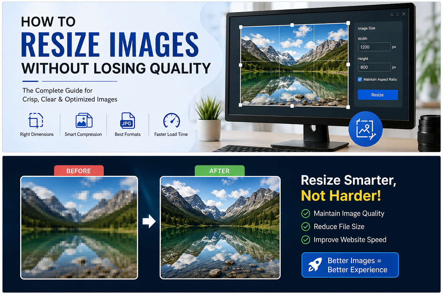
Proper image sizing is the foundation of a fast, user-friendly website.
Have you ever clicked on a link and waited for a large photograph to load from top to bottom, row by row? It is a frustrating experience. In fact, large unoptimized image files are the single most common reason for slow web pages today. If you run a blog, manage an online store, or build websites for clients, understanding how to resize your images properly is a basic skill you need to master.
Modern digital cameras and smartphones take fantastic pictures. They capture an incredible amount of detail. The problem is that these pictures are often over 4,000 pixels wide and several megabytes in size out of the box. If you place a file that large directly onto a standard web page, you force the user's browser to download the entire massive file and then visually shrink it to fit inside the layout of the screen. This wastes a lot of data and destroys your page load speed.
By resizing an image before you ever upload it to your server, you ensure the browser only loads exactly what it needs. This drastically reduces the file size, speeds up your page load time, and keeps your visitors happy. In this guide, we are going to look closely at what it means to resize a photo, how it differs from file compression, the rules of aspect ratios, and the exact dimensions you should be using for your projects.
Need to Resize an Image Right Now?
If you have a photo that needs to be scaled down immediately for a project, skip the theory and try our fast, free resizing tool.
Open Free Image Resizer ToolThe Hidden Cost of Massive Image Files
Website speed is no longer just a luxury. It is a strict requirement for doing business online. Search engines like Google measure how fast your main content loads using a metric called Largest Contentful Paint. If your page takes more than two and a half seconds to load the main visual element, search engines will penalize your site in the rankings. Your competitors will outrank you simply because their websites are lighter and faster.
Beyond search engine rankings, large images hurt the actual human beings using your site. Mobile users are often browsing on limited data plans or weak cellular connections. When you force them to download a 6-megabyte photograph just to read a simple blog post, you eat into their data and their patience. Most users will abandon a website if it takes more than three seconds to load. Resizing your images is the easiest and most effective way to prevent this from happening.
Understanding Resizing vs. Compression
People often use the terms resizing and compression interchangeably. They go hand in hand when optimizing a website, but they are two completely different technical actions. You need to do both to get the best results.
Resizing changes the physical dimensions of the image on the screen. Think of it like taking a giant movie poster and trimming the edges until it is the size of a standard sheet of paper. You are changing the width and the height. For example, you might take a picture that is 4,000 pixels wide and scale it down so it is exactly 800 pixels wide. The picture looks exactly the same, but it is physically smaller.
Compression changes how the data inside the image is stored on the hard drive. It reduces the file size in kilobytes or megabytes without necessarily changing the physical width and height. As noted in our previous digital asset guide, lossy compression reduces the file size by permanently deleting data, whereas lossless compression looks for statistical redundancies to shrink the file without deleting data[span_0](start_span)[span_0](end_span).
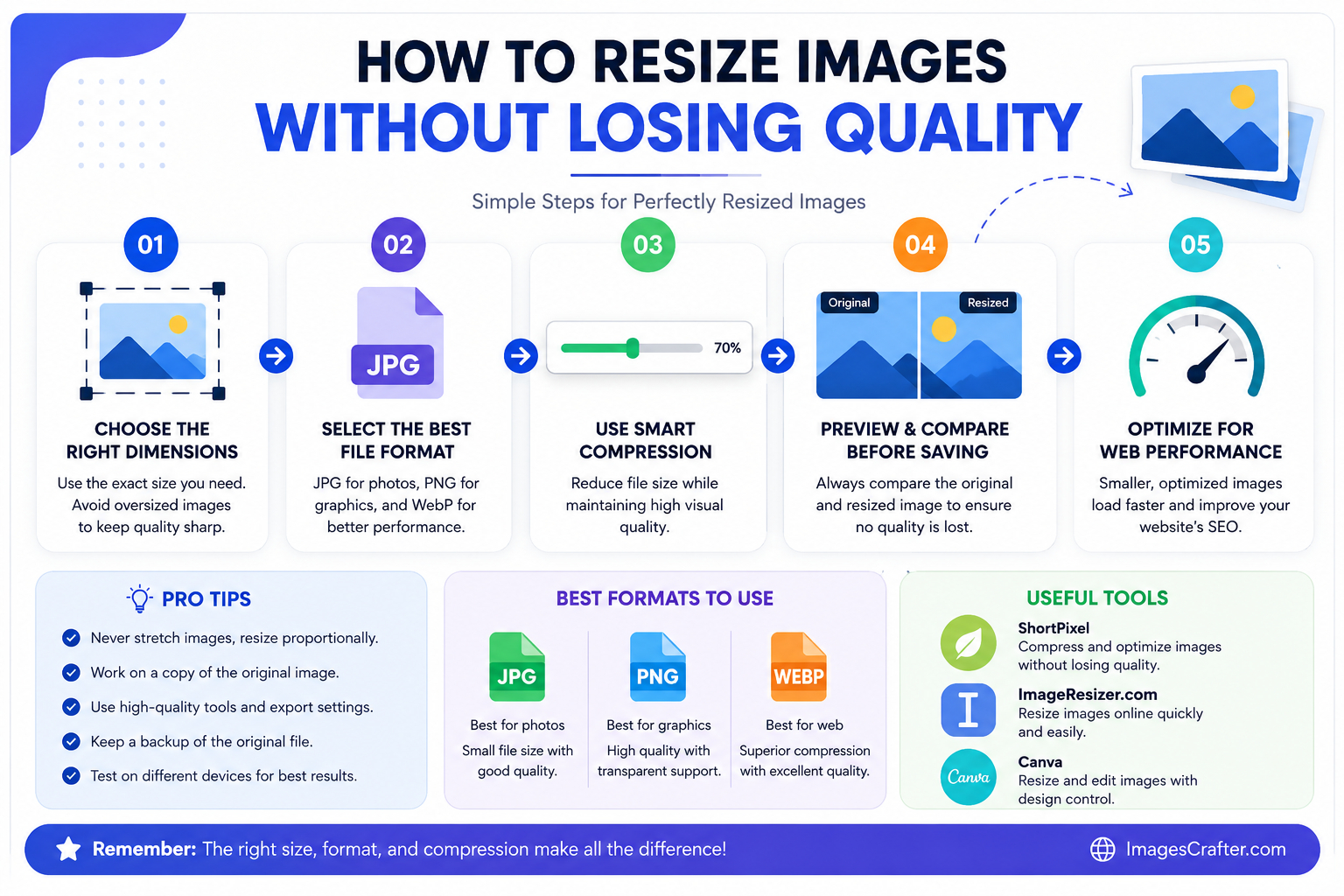
Resizing changes the physical boundaries, while compression changes the data density.
The correct workflow is always to resize the image to the proper dimensions first, and then run it through a compression tool to squeeze out any remaining unnecessary data.
Why Aspect Ratio is Crucial
When you use an image resizer, you will almost always see an option to lock the aspect ratio. The aspect ratio is the proportional relationship between the width and the height of an image. For example, a square image has an aspect ratio of 1:1. A standard widescreen video has an aspect ratio of 16:9.
If you change the width of an image without changing the height proportionately, the image will stretch or squash. People will look unusually thin or unnaturally wide, and circles will turn into ovals. You want to avoid this at all costs. Always make sure your aspect ratio is locked when resizing. If you need an image to fit a specific square box on your website but your original photo is a wide rectangle, you cannot just resize it to fit. You have to crop the image first to change its basic shape, and then resize the cropped version.
Choosing the Right Format Before You Resize
Before you alter your dimensions, make sure you are working with the correct file type for your specific needs. The format you choose determines how well the image will retain its quality after it is scaled down. Here is a quick breakdown of standard formats for web use:
- JPEG: The JPEG format is the workhorse of the internet and is designed specifically for photographs[span_1](start_span)[span_1](end_span). If you have a picture of a landscape, a person, or a product with thousands of different colors and subtle shadows, use JPEG. It handles the color blending very well at smaller sizes.
- PNG: If your image requires precision, PNG is the better option[span_2](start_span)[span_2](end_span). It is perfect for logos, icons, screenshots of text, and any graphic that needs a transparent background[span_3](start_span)[span_3](end_span). Because PNG files are larger by nature, it is extra important to resize them properly so they do not slow down your site.
- WebP: This is the modern standard[span_4](start_span)[span_4](end_span). It offers incredible compression for web design and is highly recommended if you want to optimize your site for search engines[span_5](start_span)[span_5](end_span). You can often take a resized JPEG and convert it to WebP to save an additional thirty percent of the file size without any visible loss in quality.
Exact Dimensions You Should Use for Your Website
One of the most common questions beginners ask is exactly how many pixels wide their images need to be. The answer depends on where the image will be displayed on the page. You never want to upload an image that is significantly wider than the container it sits in. Here are a few standard dimensions that work well for most modern digital projects:
- Website Backgrounds or Hero Images: 1920 pixels wide. This covers standard full high-definition desktop monitors. Going larger than this usually wastes bandwidth.
- Blog Post Feature Images: 1200 pixels wide. This size is large enough to look crisp on a high-resolution tablet but small enough to load quickly. It is also the ideal size for sharing links on social media platforms like Twitter and Facebook.
- Images Inside a Blog Post: 800 to 900 pixels wide. Most blog text columns are not wider than 800 pixels. An image wider than the text column is just carrying wasted data.
- E-commerce Product Photos: 1000 to 1200 pixels wide. You want these slightly larger so that users can use a zoom feature to see the fine details of the product without the image getting blurry.
- Website Logos: 250 to 300 pixels wide. Logos should be extremely small and preferably saved as a PNG or SVG file.
How File Naming Impacts Your SEO
Your work is not done just because the image is the correct size. Search engines cannot physically see the content of your images. They rely on the text data attached to the file to understand what it is. If you upload an image straight from your camera, it will likely be named something like IMG_8742.jpg. This tells search engines absolutely nothing.
Before you upload your newly resized image, rename the file on your computer. Use clear, descriptive words that explain exactly what is in the photo, and separate those words with hyphens. For example, if you have a picture of a coffee mug on a desk, rename the file to blue-coffee-mug-on-wooden-desk.jpg. This simple step, combined with a fast loading time from proper resizing, gives you a massive advantage in image search results.
A Simple Workflow for Flawless Images
When you sit down to optimize your visual assets for a new project, follow a strict routine to protect your original files and guarantee the best results.
First, always keep a master copy. Because saving a JPEG repeatedly causes a loss in quality over time, you should keep your original, high-resolution photo safe in a separate folder[span_6](start_span)[span_6](end_span). Never overwrite the original file. Create a copy of the photo and open that copy in your image resizer.
Second, resize the image to the exact pixel width you need based on the guidelines above, making sure the aspect ratio is locked. Third, run that resized image through a compression tool to remove any hidden data bloat. Finally, rename the file properly before uploading it to your content management system.
Final Thoughts
Taking a few extra seconds to run your photos through an image resizer makes a massive difference for your digital footprint. You will save server space, improve your user experience, and create a much faster website. Your visitors will thank you by staying on your page longer, and search engines will reward you with better visibility. Start building this habit today, and never upload a raw, unedited photo to your website again.